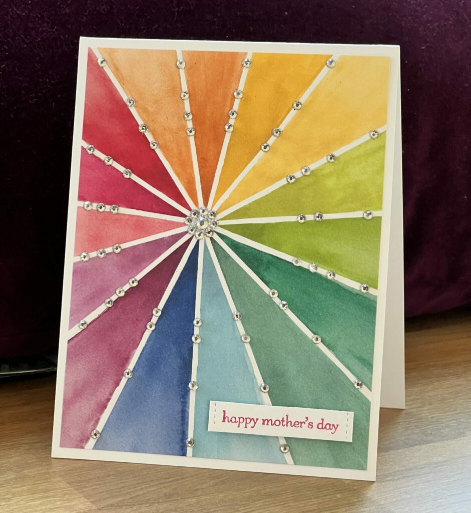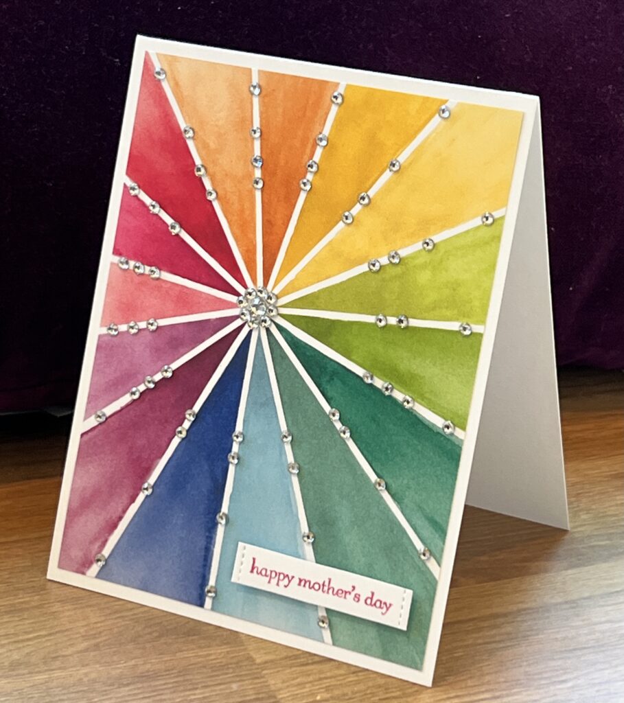
Still going crazy with the rhinestones and my favorite new Designer Series Paper from the 2024-2025 Stampin’ Up annual catalog! I did something very similar with my last card with the same DSP: cut a 4”x5 1/4” piece of the paper (and I spent at least half an hour agonizing over how to cut this; would it be prettier with mostly the blues and greens showing, or perhaps the pink and purple and reds?) and stick it onto a standard size card front, then plop about half a pack of rhinestones on it!
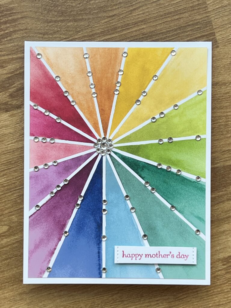
The most important thing is to resist the temptation to center the paper when you cut it. For some reason this design looks way better off-centered. And there is a sort of similar issue with the rhinestones: I started out placing them evenly away from the center, and then that just didn’t look right, so (naturally) I had to keep on adding more rhinestones kind of stretched out along the white lines. I always go overboard with embellishments; I don’t think I’ve managed to make a card—ever—where I put on three little rhinestones or sequins or whatever and call it a day!
